


Choose flat embroidery for fine detail, small text, and lightweight garments. Choose 3D puff for bold, raised logos on structured caps and heavy outerwear. Flat costs less, wears longer, and reads cleaner at small sizes; puff costs more, needs precise digitizing, and delivers a dimensional look that photographs beautifully but can’t handle fine detail.
TL;DR:
- Flat embroidery allows for smaller text and fine details, making it ideal for corporate logos, jersey numbers, and detailed crests, and it costs less and lasts longer.
- 3D puff embroidery creates a raised, sculpted look with foam, suitable for bold logos on structured caps, heavy outerwear, and larger shapes, but requires more expensive materials and precise digitizing.
- Puff is limited to shapes wider than about 3 to 4 millimeters, while flat can produce finer lines and thin outlines with greater durability after repeated washing.
- Combining puff and flat in the same design is common, with puff handling the main logo or emphasis and flat managing supporting fine detail, provided digitization is done correctly.
- Proper care involves washing puff pieces inside out on gentle cycles and avoiding heat to prevent foam cracking or flattening, whereas flat embroidery tolerates regular washing better over time.
Table of Contents
- What is flat embroidery, and why does it dominate detailed logos?
- What is 3D puff embroidery, and how does the foam create that raised look?
- How do puff and flat compare on design limits, durability, cost, and speed?
- What should you tell your digitizer about puff and flat settings?
- Which garments and fabrics suit puff, and which need flat?
- How should you wash and care for puff versus flat embroidery?
- Can you combine puff and flat on the same design?
- How Plaid Gorilla Golf chooses embroidery for our hats and hoodies
- Where do puff and flat fall short on colour and fine detail?
- What can go wrong with 3D puff embroidery over time?
- Designer checklist: five questions to decide right now
- Get the look right the first time with Plaid Gorilla Golf
- Sources
- FAQ
What is flat embroidery, and why does it dominate detailed logos?
Flat embroidery sits directly on the fabric surface using three core stitch types: satin stitches for borders and text, fill stitches (usually tatami) for larger areas, and running stitches for outlines and fine linework. Each stitch lies flush against the garment, which is exactly why it can render small text, thin serifs, and layered colour transitions that puff simply cannot reproduce.
That flatness is a strength, not a compromise. Because the thread sits close to the fabric, digitizers can shrink letter heights and stroke widths far below what any raised technique allows, which is why flat remains the default for corporate logos, jersey numbers, and multi-colour crests.
- Satin stitches handle borders, text, and small emblem outlines with a smooth, glossy finish.
- Fill stitches cover larger shapes efficiently without excess thread buildup.
- Running stitches create fine detail lines, like veins in a leaf or thin outline work.
- Production runs faster and costs less per unit than 3D puff, making flat the practical choice for bulk apparel orders.
What is 3D puff embroidery, and how does the foam create that raised look?
3D puff embroidery builds a foam underlay beneath the design, then stitches satin columns directly over it. Once the machine finishes, excess foam gets trimmed away from the edges, leaving a raised, sculpted letterform that catches light and shadow in a way flat thread never will.
Foam thickness drives the final effect. Industry guidance points to roughly 2 to 3 millimetres for general apparel, with 3 millimetres standard for caps, and up to 4 millimetres for heavier canvas or denim. The foam itself sits under satin stitching, which needs more spacing between rows than flat work requires, so puff is naturally suited to bolder shapes rather than fine detail.
- Structured caps and snapbacks: the front panel’s rigidity supports the foam without collapsing.
- Beanies and rope hats: raised text pops against textured knit or rope trim.
- Heavy outerwear: hoodies with thick fleece backing can tolerate the extra stitch density puff demands.
- Bold branding moments: a single word or icon meant to dominate the visual, not share space with fine print.
How do puff and flat compare on design limits, durability, cost, and speed?
Puff and flat aren’t competing versions of the same technique. They solve different problems, and the numbers make that obvious once you line them up.
- Minimum widths: puff columns need roughly 3 to 4 millimetres to stay stable and avoid collapsing during stitching, while flat can go considerably smaller, including fine serif text and thin outlines.
- Durability: flat embroidery holds up to repeated washing and everyday abrasion with minimal change in appearance. Puff is more vulnerable to crushing, heat, and friction, since the foam core can flatten or crack under pressure it wasn’t built to handle.
- Cost and production time: puff typically costs more per unit because it requires foam placement, trimming, and denser stitching, all of which add machine time. Flat runs faster and cheaper, especially at volume.
- Visual and tactile impact: puff gives a design physical presence you can feel with your fingers; flat gives you cleaner detail and a lower profile that works closer to seams and trim.
If your project needs both a bold statement piece and small supporting text, you’ll likely need both techniques on the same garment, planned carefully from the start.
What should you tell your digitizer about puff and flat settings?
Digitizing is where puff projects succeed or fail, and it’s not a step to leave to guesswork. For puff, tatami fills over foam are risky because they crush the foam flat. Instead, specify edge-run underlay only, add solid end caps to seal column edges, and increase stitch density so the thread fully covers the foam without gaps that let it peek through.
For flat, standard tatami fills and normal stitch densities work fine for larger shapes, but thin strokes and small text need finer satin runs with tighter spacing to stay legible.
Sequencing matters too. Puff sections should generally be digitized and stitched as isolated objects, separate from any flat detail sharing the same design, so the machine handles foam placement and trimming before moving to fine linework.
Pro Tip: Always request a physical test sample before a full production run, especially on puff. Foam behaves differently across cap materials, and what looks right on screen can peek through or flatten once stitched.
Which garments and fabrics suit puff, and which need flat?
Garment structure decides more of this choice than design preference does. Puff needs a firm base to push against, and if the fabric can’t provide that resistance, the foam won’t hold its shape properly.
- Best for puff: structured caps with buckram fronts, heavy canvas, denim, and lined outerwear like the Gulf of America baseball hat.
- Best for flat: t-shirts, polos, knitted fabrics, and any placement near seams, zippers, or areas with natural stretch.
- Watch for: puckering on lightweight fabrics under puff’s added stitch density; a cutaway or tearaway stabiliser backing usually solves this before it becomes a returned order.
An adjustable structured cap with a firm crown handles puff far better than a soft, unstructured trucker panel, which is one reason cap style matters as much as embroidery style.
How should you wash and care for puff versus flat embroidery?
Puff and flat age differently, and treating them the same way shortens the lifespan of the raised design specifically. Foam is more sensitive to abrasion and heat than flat thread, so care routines need to account for that.
Wash puff pieces inside out on a gentle cycle, and skip the dryer entirely. Direct heat and tumbling friction are what flatten foam over time or cause the surface to crack. Flat embroidery tolerates normal washing far better, with less risk to appearance even after regular use.
For work uniforms or items facing constant contact, like bag straps or high-traffic apparel, flat is usually the safer long-term choice over puff.
Can you combine puff and flat on the same design?
Combining both is a common professional move, and it works well when the roles are clear: puff carries the primary lettering or emblem, flat handles small supporting text or fine detail work around it.
- Keep puff elements above the 3 to 4 millimetre minimum width for stability.
- Use solid end caps where puff columns meet flat detail to avoid a ragged transition.
- Plan for separate digitizing runs, since puff and flat sections need different underlay and density settings to stitch cleanly on the same garment.
Done right, this pairing gives you a design with a dominant raised focal point and legible fine print, without asking either technique to do a job it wasn’t built for.
How Plaid Gorilla Golf chooses embroidery for our hats and hoodies
Our rope hats and snapbacks run puff. Structured cap fronts give the foam something firm to press against, and a raised wordmark reads better from ten feet away than flat ever could on a curved panel. Our hoodies run flat. Fleece drapes differently than a cap crown, and flat keeps the Bogey Enthusiast branding crisp without adding stiffness across the chest.
“The rule we follow is simple,” says Mike. “Match the technique to what the garment structure can support, then digitize for that specific fabric, not a generic template.” That approach is why our caps hold their raised shape drop after drop, and why our hoodie graphics stay sharp wash after wash.
— Mike
Where do puff and flat fall short on colour and fine detail?
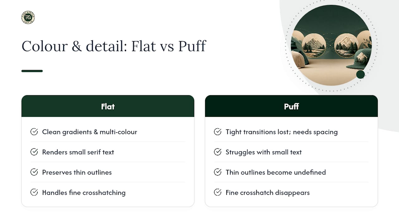
Flat embroidery can blend colours through shading techniques and layered stitch directions, letting a digitizer suggest gradients or depth within a small logo footprint. It handles multi-colour crests, gradient shadows, and thin outline separations between colours cleanly, because the thread sits flat and each colour block can sit precisely against its neighbour.
Puff struggles here in a way flat doesn’t. Foam and satin stitching over it need extra spacing between elements, so tight colour transitions and layered shading get lost. A puffed letter can carry one dominant colour cleanly, maybe two if the design leaves generous separation, but attempting a five-colour gradient on a raised letter usually ends in muddy, poorly defined edges.
Detail level follows the same pattern. Flat can render a serif font at a small size, a thin outline around a mascot, or fine crosshatching inside a shape. Puff can’t. The foam’s physical height means any detail smaller than roughly 3 to 4 millimetres either disappears entirely or crushes the foam trying to stitch around it.
This is why most brands treat puff as a headline technique and flat as the supporting cast. A single bold wordmark or icon in puff, paired with flat for a tagline, sponsor logo, or care label graphic, gets the visual impact without asking one technique to do a job outside its range. If your design leans heavily on colour blending, shading, or fine detail throughout, flat is very likely your only realistic option regardless of how the rest of the garment looks.
What can go wrong with 3D puff embroidery over time?
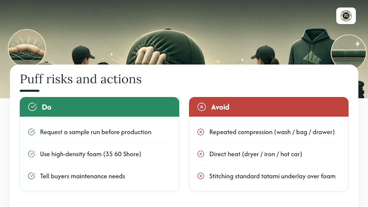
Foam breakdown is the biggest long-term risk with puff, and it’s mechanical, not cosmetic. Repeated compression from washing, sitting in a bag, or being crushed under other items in a drawer gradually flattens the foam’s structure. Once that happens, the raised effect that justified the extra cost is gone for good, and there’s no way to restore it after the fact.
Cracking is the second major risk, usually tied to heat. Direct dryer heat, ironing near the design, or leaving a capped or hooded garment in a hot car can cause the satin stitching over the foam to crack along stress points, particularly at sharp letter corners where stitches change direction abruptly. Using high-density foam rated around 35 to 40 shore hardness reduces this risk considerably compared to softer craft-grade foam, which crumbles under far less pressure.
Improper digitizing creates its own set of problems before the garment ever reaches a customer. Standard tatami underlay stitched directly over foam crushes it flat during production, erasing the dimensional effect before the piece leaves the shop floor. That’s a supplier error, not a wear-and-tear issue, but it’s common enough that requesting a sample run before full production is worth the extra day it takes.
None of this makes puff a poor choice. It just means puff carries maintenance requirements flat embroidery doesn’t, and buyers should know that going in rather than discovering it after the first wash cycle.
Designer checklist: five questions to decide right now
Before you brief a supplier, answer these:
- What’s the garment’s structure, structured cap, hoodie fleece, or lightweight knit?
- Do you need a bold, photo-ready statement or fine, readable detail?
- What’s the smallest text size the design must stay legible at?
- What’s your budget and turnaround window?
- How will the wearer actually care for this piece day to day?
Your answers to these five almost always point clearly toward one technique over the other.
Get the look right the first time with Plaid Gorilla Golf
We’ve made these embroidery calls on every drop we’ve released, so you don’t have to guess which technique fits your favourite piece. Our Champagne Tees Rope Hat in Ponderosa Pine and Country Club Snapback in Navy/Cloud White both run raised puff on structured crowns built to hold it. Our Bogey Enthusiast Hoodie in Pine runs flat embroidery across fleece, keeping the wordmark crisp wash after wash.
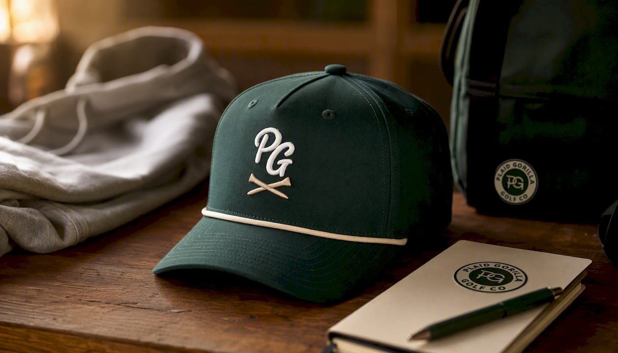
If you want both looks in one order, The Bogey Kit pairs the Country Club Hat with the Bogey Enthusiast Hoodie, and The Course Kit bundles a Rope Hat with a Prime Hoodie for the same puff-and-flat contrast. Prefer to build your own combo? The Prime Hoodie in Real Teal and The Club Kit with the Country Club Snapback are both in stock now. Browse the drop and pick the piece that matches the embroidery you actually need.
Sources
For readers briefing their own supplier, these sources back the numbers used throughout this guide: Wilcom’s webinar Q&A covers underlay and density settings for puff; Printful’s help article explains foam mechanics plainly; and LeelinePromotion’s SOP guide sets out foam thickness and minimum column width standards worth sharing with any digitizer.
- Q&A from 3D Puff Embroidery Webinar — Wilcom
- What is 3D puff embroidery, and how does it work? — Printful Help
- Puff embroidery guide: a step-by-step SOP for flawless 3D results — LeelinePromotion
FAQ
What are the key differences between flat embroidery and 3D puff embroidery?
Flat embroidery lies directly on fabric using satin, fill, and running stitches, allowing fine detail and small text. 3D puff adds a foam underlay beneath satin stitching, creating a raised effect suited to bold, simple shapes rather than fine detail.
What does 3D puff embroidery look like?
It looks dimensional and sculpted, with letters or logos rising above the fabric surface rather than sitting flush against it. The raised texture catches light and shadow, which is part of why it photographs so well on caps.
Is puff embroidery more expensive than flat embroidery?
Yes. Puff typically costs more because it requires foam placement, trimming, and denser stitching, all of which add machine time compared to standard flat runs.
What are the three main types of embroidery stitches?
The three core stitch types are satin stitches for borders and text, fill stitches for covering larger areas, and running stitches for fine outline detail. Both flat and 3D puff embroidery build on these same stitch foundations, with puff adding a foam layer underneath.
Does Plaid Gorilla Golf use puff or flat embroidery on its products?
Both, depending on the garment. Structured caps and rope hats like the Ponderosa Pine Set use raised puff on the crown, while hoodie graphics run flat for a cleaner finish on fleece.