


Bold colourways are popular in 2026 because runway forecasters, consumer psychology, and platform behaviour all converged at the same moment, pushing vivid palettes from niche statement to mainstream default. The short version: people want to feel something when they get dressed, and colour is the fastest way to do it.
The core drivers, in brief:
- Runway and forecaster signals: Major fashion weeks and bodies like WGSN and Coloro validated saturated palettes for SS26, while bold block colours dominated designer presentations across multiple houses.
- Dopamine dressing: Post-pandemic emotional recovery made bright, expressive clothing a practical self-care tool, not just a style choice.
- Nostalgia and maximalism: Y2K and early-2000s colour memory cycles back every two decades; 2026 landed squarely in that window.
- Social media amplification: TikTok and Instagram reward visual contrast, and nothing photographs like a saturated hue against a neutral background.
- Retail and rental demand: Statement-piece bookings and resale prices for neon and jewel-tone vintage pieces rose as consumers put money behind the trend.
Key takeaways
Bold colourways are popular in 2026 because runway forecasters, dopamine dressing psychology, grassroots social-media amplification, and measurable retail demand all reinforced each other at the same moment.
| Point | Details |
|---|---|
| Runway and forecaster consensus | WGSN, Coloro, and major fashion weeks validated vivid palettes for SS26, with bold block colours across multiple designer presentations. |
| Psychological driver | Dopamine dressing links bright clothing to emotional self-care; enclothed cognition research shows colour affects mood and purchase intent. |
| Retail confirmation | Rental bookings for statement pieces and resale price premiums on jewel-tone vintage items confirmed consumer spending followed the trend. |
| 2026 palette anchors | Jewel tones (cobalt, eggplant), neon flares (electric fuchsia), bridge shades (mauve), and botanical accents (ponderosa pine, ochre) dominated. |
| Plaid Gorilla Golf application | Plaid Gorilla Golf’s limited drops, including the Bogey Kit and Bogey Enthusiast Hoodie in Pine, apply the botanical palette with premium materials and drop-bundle strategy. |
Table of Contents
- Why are bold colourways so popular in 2026, according to forecasters?
- How does colour psychology explain the appeal of bold fashion choices?
- What retail and platform data confirm that consumers are buying bold in 2026?
- Which specific colourways and palettes showed up most in 2026?
- How did designers apply bold colour to materials and silhouettes?
- What does the bold-colour trend mean for Canadian shoppers?
- How Plaid Gorilla Golf applied bold colourways to golf apparel in 2026
- How did social media and influencer culture spread bold colourways in 2026?
- How sustainability is shaping colour choices in fashion
- Where the bold-colour trend goes from here
- Wear the trend, not just the theory
- Sources
- FAQ
Why are bold colourways so popular in 2026, according to forecasters?
The institutional story of 2026 colour is a study in tension. Pantone’s official picks leaned toward quieter, more grounded shades, while WGSN and Coloro mapped a parallel track: vivid hues tied to emotional recovery and cultural re-engagement. SS26 trend reporting frames the season as one of reorientation and mindful expression, where bright palettes became a vehicle for individuality rather than spectacle.
The runway evidence is hard to argue with. WWD’s spring 2026 bold-colour gallery documents saturated hues and colourblocking across multiple shows, from structured tailoring to fluid eveningwear. Street-style photographers at the same shows captured the same palette shift happening off the runway, confirming that the trend had moved from editorial to wearable.
What made 2026 different from previous colour cycles was the grassroots pressure from below. Indie brands and social-media communities drove neon and rave-influenced colours even when institutional authorities favoured restraint. Jacquemus, Balenciaga, and Marc Jacobs all leaned into electric palettes, but so did dozens of smaller labels whose TikTok reach rivalled legacy houses. The grassroots signal shaped retail sales more directly than any Pantone announcement.
Key runway and forecaster signals for 2026:
- WGSN and Coloro mapped vivid palettes to emotional recovery and consumer optimism.
- Pantone’s quieter institutional picks were outpaced by grassroots neon and jewel-tone adoption.
- Multiple major houses presented rainbow brights and bold block colours in SS26 collections.
- Street-style photography confirmed the trend moved from runway to real wardrobes quickly.
How does colour psychology explain the appeal of bold fashion choices?
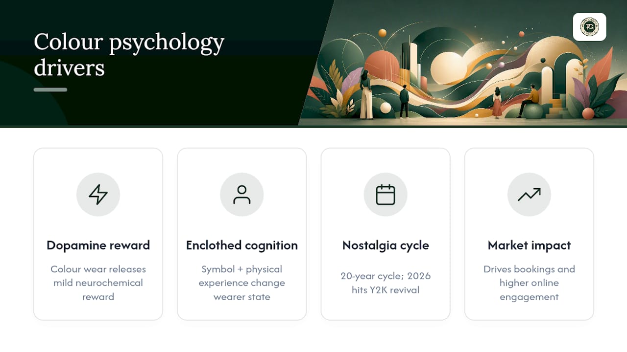
Dopamine dressing is the term the industry settled on, but the mechanism is older than the phrase. Wearing a colour that triggers a positive emotional association releases a mild neurochemical reward. After years of muted, “safe” dressing, consumers were primed for that hit.
Research on colour in apparel merchandising draws on Ecological Valence Theory and the concept of enclothed cognition to explain why colour choices affect mood and purchase intent. Enclothed cognition, specifically, holds that the symbolic meaning of a garment and its physical experience combine to influence the wearer’s psychological state. A cobalt blazer does not just look confident; it can make the wearer feel it.
“Dopamine dressing is not merely hedonistic — forecasters and rental data suggest it is a practical commercial phenomenon that drives bookings for statement pieces and measurably higher engagement online.” Form & Taste Trend Analysis
Nostalgia adds a second layer. Colour trends cycle roughly every 20 years, and 2026 lands exactly in the window for Y2K and early-2000s revival. Electric fuchsia, highlighter yellow, and saturated cobalt all carry memory associations for millennial and older Gen Z shoppers, making them feel familiar rather than risky. That familiarity lowers the psychological barrier to purchase.
The maximalist reaction to “quiet luxury” also matters. After several seasons of beige and greige, bold colour reads as a deliberate counter-statement. Personalised shade selection — choosing tones that connect to personal memory or identity — is what separates authentic dopamine dressing from trend-chasing, and it is exactly what forecasters recommend to avoid the “trendy but hollow” trap.
What retail and platform data confirm that consumers are buying bold in 2026?
Runway enthusiasm only counts if consumers follow with their wallets. The retail signals for 2026 are clear. Statement-piece bookings on rental platforms rose as shoppers sought vivid, occasion-ready looks without committing to full purchase price. Resale platforms showed price premiums on neon and jewel-tone vintage pieces, a reliable leading indicator that a colour story has moved from editorial to desirable.
Colour-intelligence platforms now map emotional zones to palette choices, using search-velocity data and demographic signals to validate which shades perform commercially. Brands that used these tools in 2026 could see in near real-time which saturated hues were gaining traction with specific buyer personas, removing much of the guesswork from seasonal buys.
Pinterest search trends for jewel tones, electric fuchsia, and cobalt outfits climbed steadily through late 2025 and into 2026. TikTok’s “outfit of the day” content skewed heavily toward high-contrast, saturated looks, with engagement metrics favouring bold pieces over neutral ones by a significant margin.
Practical retail indicators worth tracking:
- Search volume growth for specific hue terms (cobalt, electric fuchsia, eggplant) on Pinterest and Google.
- Resale price movement for neon and jewel-tone vintage pieces on platforms like Depop and Vestiaire Collective.
- Rental booking rates for statement-colour occasion wear.
- Limited-edition drop sell-through speed as a proxy for consumer appetite.
Which specific colourways and palettes showed up most in 2026?
Runway and buyer commentary identified several recurring palette anchors for 2026 editorial and retail assortments. They fall into four recognisable groups:
Jewel tones anchored the premium end. Deep eggplant, cobalt blue, and forest emerald appeared in structured tailoring, outerwear, and accessories. These shades read as bold without feeling aggressive, which made them accessible to shoppers who wanted colour but not chaos.
Neon flares carried the maximalist energy. Electric fuchsia and highlighter yellow were the two most-cited runway shades, appearing in everything from Versace eveningwear to indie streetwear drops. These are the shades that photograph loudest and perform best on social feeds.
Bridge shades served the “bold-curious” shopper. Mauve, dusty rose, and warm terracotta offered saturated colour without the commitment of a full neon. They paired easily with denim and neutral outerwear, making them the practical entry point for Canadian shoppers navigating a cold-weather wardrobe.
Botanical and earth accents rounded out the palette. Ponderosa pine, olive, and warm ochre brought nature-derived richness that felt grounded and season-appropriate. These shades worked particularly well in performance and lifestyle categories, where the colour needed to read as intentional rather than loud.
How did designers apply bold colour to materials and silhouettes?
Bold colour lands differently depending on what it is printed on or dyed into. The 2026 consensus from buyers and critics was that vivid hues read as premium when paired with elevated materials and careful construction. A cobalt in a cheap polyester reads as costume; the same cobalt in a heavyweight fleece or structured suiting fabric reads as intentional.
Silhouette choices reinforced the message. Oversized outerwear in jewel tones used volume to make colour feel architectural rather than decorative. Tailored blazers in electric fuchsia worked because the precision of the cut balanced the intensity of the hue. Accessories, particularly hats and bags, became the lowest-risk entry point: a saturated snapback or rope hat lets a wearer test a bold palette without committing a full outfit to it.
Material categories where bold colour succeeded most consistently:
- Heavyweight fleece and structured knits (colour depth reads well, texture adds perceived value).
- Sequins and metallic fabrics (neon amplified by reflective surface).
- Faux fur and shearling (jewel tones feel luxurious against tactile texture).
- Structured suiting fabrics (bold hue anchored by sharp construction).
Pro Tip: When styling a bold piece, ground it with one neutral: white, cream, or a deep forest tone. Designers consistently used this pairing to keep saturated colour feeling intentional rather than overwhelming. Golf clothing colour combinations follow the same logic.
Colour-intelligence tools now let brands validate these material-and-hue combinations against demographic data before committing to production runs, reducing the risk of a bold bet that misses its audience.
What does the bold-colour trend mean for Canadian shoppers?
Canada’s climate shapes how the trend translates. Bold colour in a Canadian wardrobe needs to work under a parka, layered with heavyweight knits, and across a longer cold-weather season than most runway presentations account for. That actually favours jewel tones and botanical shades over pure neons, since deeper saturation holds its visual weight under layering in a way that highlighter yellow does not.
Canadian shoppers can find bold pieces through curated online drops, local boutiques in cities like Toronto, Vancouver, and Montreal, and resale platforms where vintage neon and jewel-tone pieces have been appreciating. Quality checks matter more when buying bold: look for colourfast dyes (no fading after two washes), substantial fabric weight, and construction details like reinforced seams and quality hardware on hats and accessories.
Practical tips for building a bold capsule in a Canadian wardrobe:
- Lead with a jewel-tone or botanical shade as your anchor piece; it layers more easily than neon.
- Check fabric weight before buying online: bold colour in a lightweight fabric loses its visual authority fast.
- Use neutral outerwear (navy, cream, forest green) to let a bold inner layer show at the collar and cuffs.
- Choose golf clothing that stands out by prioritising colourfast materials and construction quality over trend-of-the-moment pricing.
- Resale platforms are a strong source for vintage jewel-tone pieces at lower price points, with the added benefit of pre-tested colour durability.
How Plaid Gorilla Golf applied bold colourways to golf apparel in 2026
Plaid Gorilla Golf’s 2026 drops are a practical case study in how a small Canadian brand can apply the bold-colour trend without losing the quality signal. The brand’s approach centres on palette continuity across drops and premium material choices that let the colour do the work.
The Bogey Enthusiast Hoodie in Pine uses a deep botanical green that sits squarely in the 2026 earth-accent palette. It is the kind of shade that reads as bold on the course but transitions easily to everyday wear, which is exactly what the “Built for the Course. Worn Everywhere Else.” positioning requires. The heavyweight fleece construction means the colour depth holds wash after wash.
The Champagne Tees Rope Hat in Ponderosa Pine pairs the same botanical tone with a rope-hat silhouette, demonstrating how accessories can carry a palette across a drop without requiring a full outfit commitment. The Country Club Snapback in Navy/Cloud White takes the opposite approach: a grounding navy anchored by a clean cream contrast, showing how bold does not always mean saturated. Sometimes it means confident and precise.
The Bogey Kit, which bundles the Country Club Hat with the Bogey Enthusiast Hoodie, illustrates the drop-bundle strategy that fashion-forward golf wear brands are using to drive higher average order values while maintaining palette coherence.
Key takeaways for small brands applying bold colour:
- Run limited drops to create scarcity and test palette reception before scaling.
- Maintain colour continuity across SKUs so hat, hoodie, and accessories feel like a designed collection.
- Invest in material quality: bold colour in a premium fabric reads as intentional; in a cheap one, it reads as costume.
How did social media and influencer culture spread bold colourways in 2026?
Social platforms did not create the bold-colour trend, but they accelerated it faster than any previous cycle. TikTok’s algorithm rewards visual contrast, and a saturated hue against a neutral background is one of the highest-contrast combinations possible. Creators who wore bold pieces consistently outperformed neutral-outfit content in watch time and saves, which trained the algorithm to surface more of it.
Influencer culture added a second mechanism: colour as identity signal. Wearing a specific shade became a way to align with a subculture or aesthetic community, from “coastal grandmother” to “Y2K revivalist” to “loud luxury.” Streetwear and skate culture played a particularly strong role in normalising neon and jewel tones outside of high-fashion contexts, making bold colour feel accessible rather than aspirational.
Social media’s role in golf fashion followed the same pattern. Golf content creators who wore bold apparel on course generated significantly higher engagement than those in traditional polo-and-khaki combinations, which pushed brands to respond with more colour-forward drops.
How sustainability is shaping colour choices in fashion
The sustainability angle on bold colour is less obvious than it looks. Natural and low-impact dyes tend to produce earthy, botanical shades rather than synthetic neons, which is one reason the 2026 palette included so many forest greens, ochres, and warm terracottas alongside the electric brights. Brands investing in GOTS-certified organic cotton or recycled fibres often found their colour range naturally gravitating toward the botanical end of the 2026 palette.
There is also a longevity argument for bold colour. A well-chosen jewel tone or botanical shade ages better than a trend-specific neon, which means consumers who buy quality bold pieces are less likely to discard them after one season. That aligns with the slow-fashion push toward fewer, better purchases. The resale market for jewel-tone and earth-accent pieces bears this out: these shades hold resale value better than seasonal micro-trend colours.
Colourfast dye technology has also improved, meaning bold colours in quality garments now survive repeated washing without the fading that once made bright pieces feel disposable. For Canadian shoppers buying bold, asking about dye process and wash durability is a practical sustainability check, not just a quality one.
Where the bold-colour trend goes from here
The evidence points in one direction: bold colour is not a single-season spike. The runway push, the consumer appetite, and the platform mechanics that amplified it in 2026 are all still in place. What changes is the palette. Neon flares will likely give way to more refined saturated shades as the trend matures, with jewel tones and botanical accents holding longer than electric brights.
The sustainability thread will pull the palette further toward natural-dye ranges over the next few seasons. That is not a retreat from boldness; it is a refinement of it. Deep eggplant, forest emerald, and warm ochre are all bold choices that happen to align with low-impact production. The brands that figure out how to deliver that combination at a quality price point will own the next phase of this cycle.
The one thing the conventional wisdom gets wrong is treating bold colour as a reaction to quiet luxury that will reverse when quiet luxury returns. These are not opposites. The 2026 consumer wants both: the quality signal of premium construction and the expressive signal of saturated colour. The brands winning right now are the ones delivering both in the same garment.
Wear the trend, not just the theory
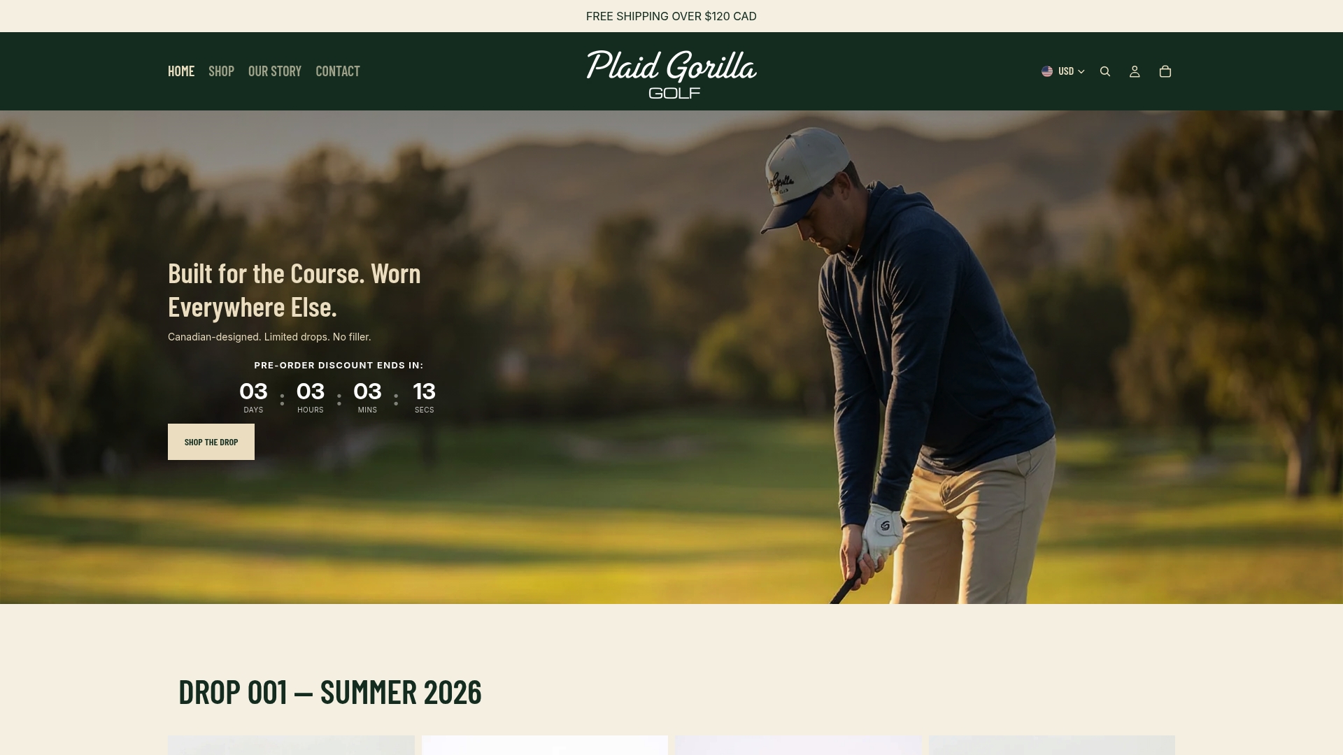
Plaid Gorilla Golf builds limited-edition golf apparel for players who want to show up in colour without sacrificing quality. The Bogey Enthusiast Hoodie in Pine and the Country Club Snapback in Navy/Cloud White are not trend pieces that age out after one season. They are premium, colourfast garments designed around the 2026 botanical and jewel-tone palette, built for the course and worn everywhere else.
If you have been reading about bold colour and want to put it on, the Bogey Kit is the sharpest starting point: a coordinated hat-and-hoodie bundle that delivers palette continuity and premium construction in one drop. Stock is limited by design. Shop the current drop at Plaidgorillagolf.
Sources
The following sources informed this article and are worth bookmarking for ongoing palette and trend updates:
- Spring/Summer 2026 Trend Report: Navigating a Season of Reorientation and Mindful Expression
- Fashion trends 2026: Why bold colours, tassels and loud luxury are in - BBC News
- Why Everyone’s Wearing Neon, Jacquemus, Balenciaga | Hypebae
- Spring 2026 Trend: Bold Colors PHOTOS
FAQ
What are the trendiest colours in 2026?
The most-cited 2026 palette anchors are cobalt blue, deep eggplant, electric fuchsia, highlighter yellow, mauve, and botanical shades like ponderosa pine and warm ochre. Jewel tones and earth accents are holding longer than pure neons.
What is the most popular colour in the world in 2026?
No single colour dominates globally, but cobalt blue and electric fuchsia appeared most consistently across runway shows, retail assortments, and platform search trends in 2026, with jewel tones broadly outperforming neutrals in statement-piece categories.
What is Gen Z’s favourite colour in 2026?
Gen Z’s colour preferences in 2026 skew toward high-contrast, identity-signalling shades: electric fuchsia, cobalt, and neon-adjacent brights that perform well on social feeds and align with Y2K nostalgia cycles.
What colour is replacing grey in 2026?
Warm botanical tones, particularly ponderosa pine, olive, and warm terracotta, are the most common replacements for grey in 2026 wardrobes, offering neutral versatility with more visual warmth and depth than cool grey.
How does Plaid Gorilla Golf apply the bold-colour trend?
Plaid Gorilla Golf uses the 2026 botanical palette, specifically deep pine and navy/cream combinations, in limited-edition hoodies and hats built from premium materials, so the colour reads as intentional and the pieces hold up beyond a single season.